Friday, 21 September 2012

Target Audience Research

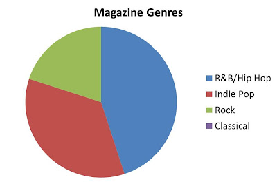
After doing some research i have decided that the age range i want my magazine to aim at is 16-26 and the demographic that i want the magazine to be aimed at is B and C1. After deciding this i went round and asked 20 people of this age range what genre magazine they would want to read if they had the choice, here are the results presented in a pie chart:

By looking at this pie chart it was very close between 'R&B/Hip Hop' with 9 votes and 'Indie Pop' with 7 votes. By gathering this information it makes me sure that i would like to do a R&B/Hip Hop magazine as it relates to a larger target audience. One thing i have noticed from this diagram however is that there seems to be a gap in the market in which R&B magazines and Hip Hop magazines are in, this brings up the question of why is there a gap in the market and could i fill it?One thing i noticed instantly from my research about why the gap is there, is because a lot of Hip Hop and R&B music magazines are aimed at the male genre, and therefore i think i should defiantly aim my magazine at a female genre to try and fill that gap in the market. Here is a slide show of music magazines aimed at the male genre.


To find out more information i went around and asked hip hop and r&b fans if they don't read magazines appropriate to their genre because their isn't any around or just because they prefer to follow their music in a different way. Here are some quotes from the research i have done:

 "because i can get the information from watching music channels and going on line" 

"I would read hip hop magazines but i don't know where to find one as you can't get them in normal high street shops"

"I can't be bothered to spend the money on a magazine"

One thing i really noticed from my research further into this subject is that Hip Hop and R&B are taste makers and therefore relates to the two-step flow in the way in which hip hop and r&B followers trust the mediator of the product and therefore want to buy it. The thing about R&B and Hip hop is that it is extremely popular and heavily advertised all around the world by TV programs, channels and festivals, this means that they are prominent genres and therefore widely available for the followers to find, compared to other genre's such as metal music where the followers would subscribe to magazines and websites because the music is only for specific tastes and they have more of a niche market and therefore magazines aimed at these genres are more likely to be bought and read because the fans cant just turn on the telly and the information appears right in front of them like what happens with Hip Hop and R&B; this however came to my interest as i discovered that when turning on the telly you can get such channels as 4music and viva who are owned by Bauer and present the hip hop genre of music, however other channels still owned by the same institution such as Kerrang and Scuzz you would have to subscribe for. This could be because Bauer have realised that they are aimed at a niche market and therefore their followers are willing to pay for the channels where as something like 'viva' the followers are not as willing to pay for and therefore Bauer includes these channels on the free list. Therefore i do think that when creating my magazine i need it need to make it quite cheap so that the readers would be prepared to pay the money for it, but also have exclusive information in it that a TV channel may not have obtained. And finally i think that i need to make my magazine accessible and advertise it, so that i can get out to the niche market that i am targeting and hopefully they will be more aware of the magazine that i have created and buy it. 

Thursday, 20 September 2012

Analysis of Hip Hop weekly cover and contents page

FRONT COVER
Hip hop weekly magazines target demographic would be between the age of 16-22. The magazine is aimed at mainly hip hop followers suggested by the name of the magazine. The cheap look and style of the magazine suggests it is for the low C-D demographic and young adults who don't have the money to spend on a expensive magazine. The magazine predominantly looks at hip hop story's in the media but also moves from R&B to Rap also.
 
 
CONTENTS PAGE
The first thing i notice about this contents page is that their isnt just one predominant artist, their are two.  This suggests that the magazine concentrates more on the stories
than the actual artists and the publicity that they bring. Another thing i have noticed is that the colour theme on it doesnt roll on from the front cover, the trademark colours of the front cover are yellow and white where as on this contents page the colours are red and white, this could suggest that the magazine doesnt really have a theme that it runs by every issue. The articles are segregated by different sub-headings such as 'word on the street' and 'style' and then under these headings are the article sneak peaks and their page numbers. I have noticed that down the right hand side of the contents page they have all the names of the publishers and writers etc, this i have not seen on any other contents page, and one last thing that seems unusual compared to the other magazines is that it doesnt have a masthead, this oculd be because it takes up space or just because they didnt think it was neccessary. 


DOUBLE PAGE SPREAD
This is a double page spread featuring reality tv stars Khloe Kardashian and Lemar Odom whom is an American proffessional basketball player, they have been married for 2 years and star on the reality tv show together with Khloe's family the Kardashians. These stars featuring in this magazine is different to the other double page spreads that i have looked at, purely because they are not r&b artists, however they are linked with the media around r&b and musuic, Khloe does her own radio show called 'Khloe after dark' on which she plays r&b music, and is an icon for millions around the world. These stars fit in with the genre of the magazine because of this, however not as much as the other magazines and their feature stories. The magazine could have chosen these types of stars because they want to differentiate themselves from the other music magazines or because they were more restricted than the other magazines of who they could interview. One thing i notice about the layout of this double page spread compared to the others is that the picture doesnt dominate the page, it is placed in the bottom right hand corner, this could suggest that the article is predominant to the actual pictures of the stars as people are more interested in what the article is saying more than looking at the stars. Another thing i have noticed is unlike the other magazines the picture isnt posed specifically for the magazine, this could be because the magazine didnt have the budget to do a photo shoot or because they just wanted to differentiate themselves from other magazines in the same genre.  


Wednesday, 19 September 2012

Institutions And Professional Bodies


In media an institution is a company that owns something, eg. Bauer is an institution that owns magazines such as 'Q'. Professional bodies have big influences on the way in which magazines are produced. This is because they set the laws and the legislations that all music magazines have to follow to not get in illegal trouble. These professional bodies help protect the public human rights laws and stop them from getting broken. It is important that professional bodies set laws and legislations, so that magazine institutions are aware of what they can include in their music magazines and what they cant for legal reasons. One thing that is really important that institutions and legal bodies must do, is keep their laws and enforce them, if they don't enforce their laws and punishments for breaking them, other institutions will just ignore the laws and carry on breaking them because they know their will be no consequences by doing this.

Analysis of XXL cover, contents page and double page spread


FRONT COVER
XXL is a predominantly Hip-Hop magazine, it was first published in 1997. The magazine looks at different Hip-Hop artists and rap stars. They also do special releases and a top ten freshmen list, the magazine is aimed at 16-25 year old and usually aimed at a male  audience. I have labelled this cover with some techniques that have been used and that i have noticed on the other covers that i have analysed also.

CONTENTS PAGE
The first thing i notice about this magazines contents page is that its layout is different to how the other magazines i have looked at have set their magazine. The layout includes pictures and articles in different spaces, instead of just featuring their cover star in the contents page they have also included other pictures of artists that they have got articles about; this makes the page look more crowded and busy. The colours that are included in this page link to the cover page as they use the same trademark colours to keep the contents page recognisable to the magazine and therefore keep the colour scheme flowing throughout. The articles in this cover page are segregated by page numbers like the other contents pages i have looked at, however they are not in any sort of order, the small clips of articles together with a picture are in random places on the page and the less dominant articles are put at the bottom of the page without a picture. I have noticed there is a predominant photo of the cover artist, this usually occurs on the cover of the magazine but in this magazine it also occurs in the contents page as the cover stars second photo is also covering part of the mast head of this page. Finally this magazine doesn't name it's contents page 'contents' instead it names it 'the b-side' this could be to differentiate itself from the other magazines as it is creative and individual.


DOUBLE PAGE SPREAD
This is a magazine double page spread featuring Usher, he is an American musician, film director and fashion designer. He focuses on urban R&B music, but also can be called a Hip Hop artist as well. This means that the artist links in well with the genre of the magazine as the magazine features mostly r&b singers. In this posed picture of Usher, it shows him smoking and looking 'cool', i think this picture really represents Usher as that's what his personality is like, therefore the magazine already just by the picture gives itself a good image as they are not portraying their artists for anything but they are, i say this because the magazine could have had a nice picture of Usher without smoking as a picture of an idol smoking could give across a bad representation to the rest of the world, but instead they put Usher smoking as that's what he does and they kept the picture genuine. Like the Blender double page spread this pages layout includes the full page photo on one side and then the writing on the other. To keep the article interesting however, they have set out the article as a question and answer, this helps the reader locate what they would find interesting and what they wouldn't, therefore keeping the article interesting and tailored to the readers own needs and wants.

Analysis of Blender cover, contents page and double page spread

FRONT COVER
Blender is an American music magazine that names itself the 'ultimate guide to music and more', it was also known for 'steamy' pictures of some celebrities.The magazine was first published in 1994 as the first digital CD-ROM magazine.
This magazines demographic is young males and females, who are interested in R&B and
Hip Hop music, it appeals to young men because they usually use young pretty women in their articles but they do also feature articles that aim at both the male and female audiences. I have labelled the picture with some techniques that seem to occur on each magazine cover i look at.


CONTENTS PAGE
At first glance of this contents page i can immediately tell that the artist Katy Perry is predominant to the actual articles that are featured in the magazine. The colours of this magazine contents page match up to the trademark colours of the cover page, which are pink, white and black, this carries the magazines theme throughout the magazine, however doesn't keep the same font as the front cover which is different to such magazines as Kerrang! who keep the same font throughout the magazine. The way in which the articles are segregated on this page are similar to Vibes contents page as they have kept the articles to the right hand side and have separated them by their page numbers highlighted by using a darker and more bold font than the rest of the writing. The sections of text identify what each separate article involves and the names of the artists involved next to the page number in the same font. This contents page also includes the date of the magazines issue and a quote from the cover artist herself, this makes the cover photo, the contents page and the article all link together as the quote is out of the article that occurs late on in the magazine.One last thing i have noticed about this contents page is that the text font for 'Contents' is the same as the cover however the letters are all in lower case and a lot bolder than the cover, this could just be because they want to fill some space on the page or because they wanted to make the title of that page stand out and keep the alignment of the page all straight as it goes all the way from the right of the page to the left.
DOUBLE PAGE SPREAD
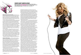
This is a magazine double page spread featuring the American singer songwriter Kelly Clarkson, she is known for her catchy hip hop and pop songs, but also being the 'original pop idol' as she was the winner of the first season of American Pop Idol TV programme. She is a perfect artist to feature in this magazine as her music and personality fits in with the light hearted pop genre of the magazine. The artist's picture in this article is a posed photo that is placed on the right hand side page, the layout of the page is very simple with the writing on the left and the one picture on the right. However the page isn't boring, it has an illustrated 'k' in the top left hand corner making the magazine layout link in with the artist, this isn't the house style of the magazine as the 'k' represents kelly and not every artist, this image would differ comparing to what artist is featuring. but also keeping the font and colour themes that run throughout the magazine. By having this simple layout it helps the reader to read the article without getting bored, as the pictures and illustrations keep the page interesting but the article is long enough for all the detail to be included. 

Analysis of Vibe cover, contents page and double page spread


FRONT COVER
Vibe magazine is a entertainment and music magazine founded by Quincy Jones. It predominantly features R&B and Hip Hop artists and other entertainers. It is produced every other month with double covers, and its target demographic is predominantly young urban followers of hip hop culture. It was launched in 1993 and was originally called Volume, the magazine was famously known for its creative direction of its covers and made sure that they constantly used models of all ethnicity's. They attract their audience through the knowledge of the particular genre for the young age range that they aim their magazine at. I have labelled this front cover to show the techniques that have been used and why they have been used to attract the audience that they are targeting.
CONTENTS PAGE
The first thing that i can see on this contents page is the dominant photo of the cover artist; this could show that the feature artist is almost more important than the articles inside the magazine, this shows that the readers are also more interested in the cover artist than any other article in the magazine. By first looking at this contents page you immediately see that the trademark colours for the inside of the magazine are grey and black, as even the photo of the cover star is in a black and white filter. The names of the articles are segregated by their page numbers in bold text, this helps the reader to identify the articles they want to read and what page they are on quickly and easily, but the small paragraphs also give a bit of information about the articles so that the reader will be able to identify which article they would be most interested in. The main image on this contents page is of Kanye West who is an American musician, film director and fashion designer. This image relates to the cover photo of this magazine which was also of Kanye West, he is also situated on the contents page because he is the feature of the main articles in this particular issue of Vibe. Another thing i have noticed when looking at Vibe contents pages is that they always put a 'V' behind the main picture, this represents the magazine; however it is a different style 'V' in every issue, making it more interesting and creative. Finally i noticed that the word 'Contents' is split onto different levels of the page; this could have been to fill space but i also think that they publication did this to make the magazine more individual and make it different from any other music magazine that is out there.


DOUBLE PAGE SPREAD           This is a magazine double page spread featuring the Hip-Hop/R&B singer and songwriter Shontelle. She is well known for her singles 'T-shirt' and 'No Gravity' and has been around since 2010. This is a great celebrity to feature in Vibe magazine as she fits in with the genre of the magazine perfectly, she is a young, successful singer. She is portrayed in this magazine as a sexy women and this is how i feel she is portrayed throughout her videos and other photo shoots also, this means that the artist is being portrayed as herself in the magazine and nothing else, this instantly makes the magazine more trust worthy as the readers wont be seeing something that they wouldn't expect. Another thing about these images is that she is almost being objectified,this could link to the magazine being the 'sexy' issue as the audience is predominantly male for this particular issue.  The layout of this double page spread includes two pictures, however one of the pictures is entwined within the text and covers the centre of the left hand page where as the second picture is placed next to the text and covers only the top right hand corner of the page, this creates a nice scene for the article as it makes the reader feel more comfortable with the words to picture ratio. The type of pictures used seem to be posed pictures specifically for the magazine not papped photos that would  be taken without the artists permission, which could eventually lead to giving the magazine a bad reputation.           


Theme


To figure out the theme i wanted to use for my music magazine i decided to have a look at my iTunes library; by looking at this i discovered that my most common genre of music is Pop and R&B. Therefore i have decided to create an R&B magazine as it will be more interesting for me and i will therefore be able to create a more interesting magazine. The one magazine i have decided to use for inspiration is VIBE, this is because it is a popular pop magazine and it features the types of artists that i would listen to and therefore is closer to home. The artist i think i am going to work around is Nicki Minaj; this is because she is a fantastic R&B singer and is rapidly growing in her market segment, therefore she would be really good to feature my magazine around as she appeals to me and the type of market i would like my magazine to aim at. Therefore i am going to research into   magazines with a similar demographic  to the type of  magazine that i would like to create.

Mood board

In order to gain inspiration for my music magazine , i have created a mood board of a collection of magazine covers from different genres.

By looking at these different magazine covers i can see that the most occurring colours seems to be red and black. Another thing that seems to appear is that the main picture of the artist goes over the header; this could show that the magazine is so well known that the picture of the artist is more important than displaying the entire name of the magazine. One last thing that i have noticed when looking at this magazine mood board is that the pictures of the artist are all posed, and none of them are actually papped photos; this could show that the magazine is serious and doesn't just rely on gossip for the information that it displays. 


Tuesday, 18 September 2012

Distribution Of Music Magazines

A suitable distribution channel for my Music magazine would be IPC.IPC Media is the UK's leading consumer magazine and digital publisher.With more than 60 iconic media brands, IPC creates content for multiple platforms, across print, online, mobile, tablets and events. They engage with 26 million UK adults - almost two thirds of UK women and over 40% of UK men. Their award winning portfolio of websites reaches over 25 million global users every month.The music magazine NME is owned by IPC media; some additional magazines that are also owned by IPC are:
-Nuts
-Chat
-Teen Now
-Marie Claire
IPC media have not published any other music magazines except for NME.I asked myself why such a company like this would want to purchase and publish my magazine in particular, i think that my magazine would be interesting to the distributer because they only own one music magazine. Because my magazine is for the Pop/Hip-hop genre i would have a much wider range of audience than NME.

About Music Magazines

Heres some information about music magazines that i found on the internet:
Definition: A music magazine is a magazine  dedicated to music and music culture, Such magazines typically include music news, interviews,  photo shoots, essays, record reviews, concert reviews and occasionally have a covermount with recorded music.
Notable music magazines: Music magazines were very prolific in the United Kingdom, with the NME (short for New Musical Express) leading the pack since its first issue in 1952. NME had a longstanding rival in Melody Maker, an even older publication that had existed since 1926; however, by 2001, falling circulation and the rise of internet music sites caused the Melody Maker to be absorbed into its old rival and cease publishing.Several other British magazines such as Select and Sounds also folded between 1990 and 2000. Current UK music magazines include Q, Kerrang! and Mojo (all published by EMAP).Magazines with a focus on pop music rather than rock and aimed at a younger market include the now-defunct Smash Hits and the BBC's Top of the Pops, which outlived the television show on which it was based.

Magazine And Their Use Of The Internet

Music magazines use the internet to expand their brands further than just print magazines, by creating their own websites and pages on existing popular websites. This gives the readers quick and easy access to find exclusive online content and review the magazine instantly. The magazines main counterparts are their own websites, as this is where most of their information is found. The magazines will often refer to their own websites in some articles in order to get more people viewing their websites and knowing about them. The companies usually put an online version of the magazine on their websites as well, this is to make it easy for readers to find them and read them. The disadvantages of having a print magazine instead of an online one is that you are not able to hear the music, you are not able to interact with the magazine, it is time consuming to write reviews and get readers feedback. However saying this, having a print copy of a magazine appeals to people because you can have a physical copy of the information as well as it being portable and creating its own leisure activity. 

AS Media Brief


We have been given a brief of either doing a music magazine or a film opening sequence. Because i have previously done a film opening sequence and didn't get the grades i expected i have therefore decided to do a music magazine instead. This will also help me broaden my knowledge on types of programmes and media knowledge to help me with my final exams in the summer as i will have a widened knowledge of magazine editorial programmes and film editing programmes.