FRONT COVER
Blender is an American music magazine that names itself the 'ultimate guide to music and more', it was also known for 'steamy' pictures of some celebrities.The magazine was first published in 1994 as the first digital CD-ROM magazine.
This magazines demographic is young males and females, who are interested in R&B and
Hip Hop music, it appeals to young men because they usually use young pretty women in their articles but they do also feature articles that aim at both the male and female audiences. I have labelled the picture with some techniques that seem to occur on each magazine cover i look at.
 CONTENTS PAGE
At first glance of this contents page i can immediately tell that the artist Katy Perry is predominant to the actual articles that are featured in the magazine. The colours of this magazine contents page match up to the trademark colours of the cover page, which are pink, white and black, this carries the magazines theme throughout the magazine, however doesn't keep the same font as the front cover which is different to such magazines as Kerrang! who keep the same font throughout the magazine. The way in which the articles are segregated on this page are similar to Vibes contents page as they have kept the articles to the right hand side and have separated them by their page numbers highlighted by using a darker and more bold font than the rest of the writing. The sections of text identify what each separate article involves and the names of the artists involved next to the page number in the same font. This contents page also includes the date of the magazines issue and a quote from the cover artist herself, this makes the cover photo, the contents page and the article all link together as the quote is out of the article that occurs late on in the magazine.One last thing i have noticed about this contents page is that the text font for 'Contents' is the same as the cover however the letters are all in lower case and a lot bolder than the cover, this could just be because they want to fill some space on the page or because they wanted to make the title of that page stand out and keep the alignment of the page all straight as it goes all the way from the right of the page to the left.
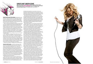
This is a magazine double page spread featuring the American singer songwriter Kelly Clarkson, she is known for her catchy hip hop and pop songs, but also being the 'original pop idol' as she was the winner of the first season of American Pop Idol TV programme. She is a perfect artist to feature in this magazine as her music and personality fits in with the light hearted pop genre of the magazine. The artist's picture in this article is a posed photo that is placed on the right hand side page, the layout of the page is very simple with the writing on the left and the one picture on the right. However the page isn't boring, it has an illustrated 'k' in the top left hand corner making the magazine layout link in with the artist, this isn't the house style of the magazine as the 'k' represents kelly and not every artist, this image would differ comparing to what artist is featuring. but also keeping the font and colour themes that run throughout the magazine. By having this simple layout it helps the reader to read the article without getting bored, as the pictures and illustrations keep the page interesting but the article is long enough for all the detail to be included.


No comments:
Post a Comment